
The final title sequence for our film, Lucid Elucidations!
Alternative Viewing Location: https://drive.google.com/file/d/1xzgs_62lCr0dy1xMx0ABxTpuYxVupCZO/view?usp=sharing
The final title sequence for our film, Lucid Elucidations!
Alternative Viewing Location: https://drive.google.com/file/d/1xzgs_62lCr0dy1xMx0ABxTpuYxVupCZO/view?usp=sharing
Wow! Editing is a lot more painful than I gave it credit for. Anyways , here it is, my CCR!
Alternative Viewing Location: https://drive.google.com/file/d/1mPRviYlADINxnleJWz-QNSn5baSRdZnM/view?usp=sharing
Hello my name is Bianca Raby, the production designer of our film opening, Lucid Elucidations! My group consists of the wonderful director Pierce Thomas, talented cinematographer Katelyn Wagner and masterful editor, Ben Isaacs. Creating our title sequence was definitely a journey, full of both tremendous triumphs, as well as many tribulations. To put it lightly, an experience that I learned an immense deal from, moreover, one that I value and will never forget. Without further ado, lets begin as I run you through my creative critical reflection!
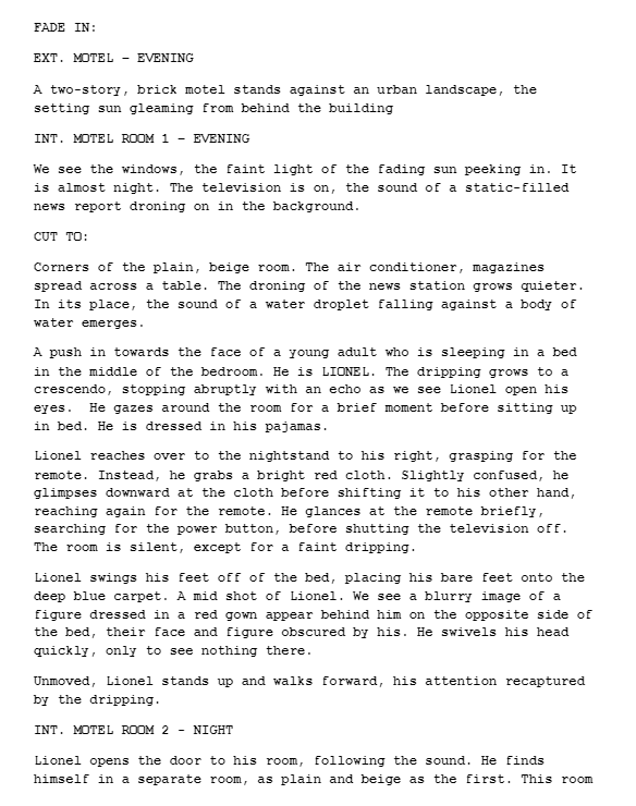
Lucid Elucidations is a psychological thriller that follows the story of Lionel, a man who suffers from head trauma and amnesia, a memory loss which has trapped him in the realm of his fears and the terrifying depths of his imagination. In essence, a mental purgatory where fantasy and reality coexist. While Lionel is battling the enigma that his personal situation has become, he is also attempting to discover what happened to his sister, and how he is somehow connected to it.
Throughout the course of filming our project we carefully referenced the conventions within our genre, not straying too far from them as we knew their implications would have a significant influence in determining how our film was received. We wanted to ensure that the genre was established clearly while also maintaining our own degree of creativity and innovation.
Since my designated role in this process was production design I took on most of the responsibility in establishing the appropriate costuming, setting, props, and lighting.
PART 1: HOW DO YOUR PRODUCTS USE OR CHALLENGE CONVENTIONS AND HOW DO THEY REPRESENT SOCIAL GROUPS OR ISSUES?
The setting of our film was conducted in a mock hospital located on our school campus. When I chose this location, I was really excited because I felt like it would create the perfect feel for our film. This was mainly due to the fact that, hospital settings are often used within the horror and thriller genre and can be incredibly creepy when manipulated correctly. Because of their close association with death, illness, and most importantly, it’s inhibitors vulnerability I believed this would do wonders in establishing the tone of our film. This has been exemplified in many horror films and shows. For instance, in the first episode of the walking dead, Rick grimes wakes up from a coma in an abandoned hospital. It is quickly, in fact, almost immediately revealed that the hospital is empty and in a severe state of disarray after a zombie outbreak erupts in america. This setting achieved well in captivating viewers and making them feel uneasy. Much like our film, the hospital setting creates the illusion of safety. Then, it subsequently has the viewers expectations inverted upon the realization that it is not as safe as it may seem. The hospital plays on Lionel’s perceived isolation, until he isn’t and we discover that he is sharing the hospital room with an unknown force, a phantom if you will.
Going off that, the costuming I chose was extremely important as well. The gown worn by the protagonist was used mostly with the intention of indicating his role as a patient. This plays into the plot in which he is attempting to discover how his ailments are connected to death of his sister. However it served a dual purpose in making him appear more vulnerable and susceptible to a potential attacker – one which is later revealed to be the shadowed figure.
A lot of the props I chose for the opening were mostly implemented to help create a feel for the setting. For example, the flowers, and the pill bottles. However, others were of greater significance. The photo frame, perhaps, which is of one of the more poignant. The photo frame depicts Lionel and his sister, leaving viewers with the chilling question of : “Well, what happened to her?’ This of course, is never revealed, though it helped to provide some context as to who the unknown figure could be. In addition, the computer, which is opened on a microsoft word document that reads the unsettling phrase, multiple times, “ I SHOULD HAVE BEEN THERE.” I developed this idea in hopes of paying homage to the iconic scene from the horror classic “The Shining”. In this scene, Wendy Torrance, after recognizing her husband’s odd behavior discovers his typewriter, accompanied by pages upon pages of the single phrase “All work and no play makes Jack a dull boy.” This scene receives continuous praise, even to this day, and rightfully so as it achieves incredible success in unnerving viewers. This idea was something I had hoped to include in our first rough cut, but was ultimately scrapped for sake of time so I’m really glad it finally made its appearance in this one.
In terms of the lighting, we seemed to have challenged what it is typically used in within our designated genre. Our lighting was, for the most part pretty high key as opposed to the low key lighting which is a common staple to the horror and thriller genre. The use of high key lighting helped to build on the illusion of safety that I had mentioned previously, shocking both the viewers, and Lionel when the scares are finally presented.
In terms of cinematography we stuck to some more common conventions. Arguably one of the most important being the, over the shoulder shots. This choice in cinematography greatly influenced the feel of the film, making the audience seem more included in the action, as well as immerse them directly into the same dangers Lionel encounters. This gave almost a first person view of everything that was occurring. We also used close ups to either emphasize the significance of certain items or the reactions of Lionel to certain stimuli. To assist in this same result, we employed mid shots and wide shots to display the environment and reveal any additional elements that provide context to the following scenes. For example, this one which reveals Katelyn’s shadow behind the curtain.
Ben was entirely responsible for editing, however we all added our own input as to how the film should look. We agreed that a blue filter added during color correction would make the sequence appear more dream like, as well as decrease the amount of contrast, extracting the color that previously existed in the scene and ultimately make it appear colder, darker and more ominous. The pacing remained generally slow and consistent throughout, emulating Lionel’s thought process as he was still trying to piece together the events he was exposed to before arriving at the hospital. The pacing increased a bit once the shadowed figure attacks him, showing Lionel, and the viewer’s heightened senses of fear and panic.
Sound was one of, if not the most important element of our title sequence. We used music produced by creator Lucas King throughout the opening to create a general sense of uneasiness and mystery. We also used various musical stings throughout to heighten the horrifying presences and fearful reactions to the events occuring onscreen. This is very common in the thriller genre and help to evoke a more augmented sense of fear and suspense from the audience. Likewise, we employed various foley sounds, like the eerie hum of air conditioning that you’d expect in a silent environment, and, in the beginning a echoing reverb of water dripping from a leaky faucet. This symbolism of water was an essential part of our branding and also helped to establish that Lionel was dreaming. This was a result of most of our sounds sounding unnatural.
Regarding representation, we challenged the conventions in the thriller genre. We employed a male victim and a female aggressor, something that isn’t seen too often in horror films since men are usually the attackers and women the victim. This is exemplified in films such as that of The Silence of the Lambs and Psycho. Furthermore, we also casted an african american lead, this is something that is not seen frequently in thrillers but also cinema in general.
PART 2: HOW DO YOUR PRODUCTS ENGAGE WITH THE AUDIENCE AND HOW WOULD THEY BE DISTRIBUTED AS REAL MEDIA PRODUCTS?
We were initially torn between a variety of production companies but eventually decided on Blumhouse Productions. This decision was mostly driven by the fact that they specialized in creating low budget horror films, and were their own independent company. This would allow us more creative liberty in producing our film and also ensure us it will be created with a degree of success we found to be satisfactory. Blumhouse has created many successful horror films that have become a modern classic of our generation, such as that of Get Out, Split, and the Purge. These films performed especially well in the box office, earning a gross box office success within the range of 100 to 300 M USD.
This leads in to another reason why we chose Blumhouse. Blumhouse has a 10 year first look deal with Universal Pictures, which will ultimately give us the opportunity to have our film distributed and purchased by them. Since Universal is one of five major media conglomerates, this will be very advantageous to have them as our backing. It will give our audience greater motivation to see our film since Universal is a highly esteemed brand known for distributing incredible blockbuster hits.
Folllowing this, our film will likely be released to film festivals , such as Sundance so it can build a reputation and obtain some hopefully good reviews, praise, or awards from critics. This will help to accumulate hype and anticipation for the film before it is sent to movie theatres for wide theatrical release. In addition, we will use various media synergy techniques, such as trailers via youtube, and other social media platforms like Snapchat and Instagram to market our film.
Finally, the intended audience of our film, which is an important factor to consider given the success of our film is entirely dependent on the people who would be investing their time and money into it. Since it will be given a rating of “R” the marketability will likely be oriented toward an age range of 18 to 24. This is due to the potentially graphic and disturbing nature of our film, which would make it unsuitable for a juvenile audience. In study conducted by Pavel Prikhodko regarding film genre preferences 84% of males chose thrillers, while 83% of women chose the same. This rejects the correlation of gender and preference within our genre meaning that our film won’t be specifically marketed towards either sex. Off the same coin, it won’t be marketed to a specific class, or race, either.
PART 3: HOW DID YOUR PRODUCTION SKILLS DEVELOP THROUGHOUT THE THIS PROJECT?
Prior to this project, I had about zero film production experience under my belt. Zip. Nada. Zulch. Creating this fiilm opening was initially a very daunting and overwhelming task. However, I quickly realized that the process is a lot easier with group members, individuals who were consistently on the same page and worked towards a common goal. This brings me to my next point. Communication. Communication was key in producing the desired results for our film. Though at some points we weren’t on the same page, our issues were quickly resolved and we were able to communicate clearly our aspirations and ideas. Every decision was made with the approval of each member. This meant that there were no surprises or confusion about what was going on, making pre and post production generally smooth sailing.
However, in producing our film, I quickly discovered that there was a lot more than meets the eye. I realized not only how much time, but how much effort and money is involved in making a film. On props and costuming alone, I spent well over $60! I also realized how to look deeper into the purpose of certain pieces and clothing as they pertained to the scenes.
As discussed in my blog, my group and I had first filmed a rough cut that did not end up making it the final as we completely discarded the footage and started back at square one. It took lots of discussion before we could come to this decision, however we believed it would be the best course of action for a variety of reasons. For one, very minimal work was accomplished during our first experience filming the rough cut. We greatly underestimated the tedious nature involved with filming, leaving us with less time to film and placing us far behind schedule. As a result of our naivety, we had to create an alternate ending that didn’t adhere to our script, making the final product appear choppy, and convoluted. We were all thoroughly disappointed with the outcome and after reviewing the hours of footage, decided we could do better.
And we did.
We learned from our mistakes and applied this knowledge to our second chance at creating our film opening. While we did make a lot of changes, I definitely believe this was for the better and I can confidently say I am more than happy with the results.
4. HOW DID YOU INTEGRATE TECHNOLOGIES- SOFTWARE, HARDWARE AND ONLINE IN THIS PROJECT?
We integrated various modes of technology into our our project. In order to establish a clear line of communication, we began by creating a group chat in Snapchat. This is where most communication outside of school occured as we were able to share photos, videos, and thoughts easily. In addition to this, our director, Pierce Thomas made a dropbox folder that everyone could access and use to upload files and clips related to the film opening.
On set, we used Katelyn’s iphone x for a majority of the shots taken. However, we also used a Canon Rebel T3I for the more sophisticated and professional shots that were impossible to capture on a mobile device. There were many complications that arose during the utilizing this camera. Though most of the issues encountered were due to our inexperience with the camera, we found the footage to be somewhat grainy and less visually appealing after it was transferred. Not to mention, the camera was quite heavy and without access to a tripod, it was difficult to use for extended periods of time. We ultimately ended up using Katelyn’s iphone due to the convenience of having the footage automatically synced to her laptop icloud.
As with producing a film, I had never even touched video editing software until, well, right now. To edit my CCR I installed a subscription based software called “Movavi”. Initially, I was pretty perterbed as I hadn’t even known where to begin, but after many youtube videos, tutorials on their website and my own experimentation, I discovered editing wasn’t too difficult at all. In fact, the process was rather simple, just very tedious and required a lot of the patience that I tend to lack. Movavi was quite simple, with little creative freedom but it got the job done nonetheless.
Our editor Ben, however used a software called “Sony Vegas Pro”. As the name suggests, this is a professional editing software that equipped him with a range of possibilities and options. Though the complictated essence of it was second nature for him, Katelyn, Pierce and I all agreed it was far beyond our understanding.
Arguably one of the most important pieces of technology we used was probably the industrial lights used to amplify the presence of shadows on the curtain in our opening. These lights were provided by Pierce’s father and, without them, I don’t believe the chilling presence of shadows would have been nearly as efffective.
Overall, I am happy to end this by emphasizing what an incredible experience this has been for me. In such a short time, I have learned a tremendous amount about what it takes to be a filmmaker and the work involved in creating a film entirely. This could not have been accomplished without my amazing group and if youve stuck around to the end, thank you. I hope you’ve enjoyed my CCR!

Now that our project is officially complete in it’s entirety, I’d like to take a moment to thank and credit everyone who helped make it happen.
First and foremost, I’d like to thank every member of my squad. This could not have been achieved without them!
I want to thank Ben for working tirelessly on editing our title sequence, for always keeping us informed about the progress of the editing, and for always consulting us with ideas and questions. Ben did a phenomenal job on editing, and I could not be happier with the result of his effort. So thank you, Ben! I’m convinced you’re gonna be world famous for your editing one day. This is only the beginning!
Next, Katelyn, our cinematographer! As with everything she works on, Katelyn was incredibly driven and hardworking, completing her job to the best of her ability all day every day! She pulled an all-nighter just to complete our storyboard! In addition to this, Katelyn possesses a wonderful vibe and wholesome spirit! When all of us were stressing about the project, Katelyn helped us to reassure and collect ourselves! So thank you, Katelyn! ❤
And of course, Pierce, the director! Similar to Katelyn, Pierce is an incredibly hardworking and motivated individual. A lot of Pierce’s strength in the creation of this project lied in the creativity involved. Pierce was entirely responsible for the script as well as the narrative concepts of the film. Pierce was an amazing director, a true leader, one that remained firm, yet always kind in his demands and expectations for the project. I believe Pierce could be a real director, someday!
Finally, Robert, our actor! Despite the (probably exasperating) hours of filming we made Robert endure, I never heard him complain, not once! Robert was always compliant with every request and instruction we had for him, even if they weren’t always communicated very clearly nor effectively. Robert stayed at the motel with us until 1 am and even drove us all home afterwards. This was especially kind of him considering he had done us the favor of starring in our film in the first place and expected nothing in return. Thank you, Robert!
Next, the individuals who, although were not directly involved in the project, were critical in making it a reality.
Mr Engle! Our AICE Media Studies teacher and mentor! Whenever we had concerns or questions regarding the progression of our film, Mr. Engle was always readily available to provide and offer his advice and input. This made the entire process appear much less formidable. Not only this, but he took time out of his day to stay after school with us so we could film our project. Mr Engle did this not because he got anything out of it, but because he wanted to see us succeed and perform well on our AICE exam. Thank you for everything you do, Mr. Engle! 🙂
And last, my parents. Without them, I would not have had transportation to the many places I needed to attend, nor would I have been able to edit and create my CCR. (my parents bought my editing software) On top of all this, my parents suffered through alllll my stress induced tempers that resulted from this project occasionally. I’m grateful they didn’t throw me out of the house, or worse, throw a shoe at me. ❤
To create my CCR, I have installed a monthly subscription based software called “Movavi”. It was $30 and is described as being generally quite user friendly. Since this was my first time even touching video editing , this seemed like my safest bet.
After some experimenting, I have quickly discovered one thing.
Editing is, and I cannot emphasize this enough, insanely tedious. So much respect and admiration is being extended to Ben at this moment in time. :,)


This software performs the basic functions of video editing. Since it is aimed specifically towards newbies such as myself, it contains many free samples that can be customized and inserted into your own videos. This has served especially helpful in moving the progress of my video forward, as I could easily drag and insert any transitions or overlays directly.


Within the Movavi video editor is a tool used specifically for recording sound. This is primarily what I’ve utilized to record the voiceover bits that are going to be inserted into my CCR. I’ve separated them all accordingly to the parts they will be located at in the video, so as to help me stay organized.

Finally, I’d just like to display the absolute mess my desktop has become. This is only a slight glimpse into all the pictures I’ve had to manually add to my desktop so that I have easy access to them while inserting them into my video. After putting all my audio clips together, my CCR is looking to be around 15- 17 minutes long, give or take. This means that many, many, more pictures will be needed. :,) The ones pictured above is just the few of several more to come.
Whether I like it or not, the CCR is soon approaching. :,)
As the production of this entire media product comes full circle , I wanted to take a moment to research exactly how I wanted to format and create mine. Asides from adding any finishing touches to my blog, this is the last thing I’ll need to have completed before I can finally close the door on this project.
Though, I’m suddenly realizing:
In order to get a better idea of how these things are made, I began first by consulting the AICE Media Studies syallabus to see exactly what the graders were looking for. As it turns out, Mr. Engle had already discussed it with us before. We did exercises in class answering these very questions. The questions are as follows:

From there, I began doing some research and watching CCR’s from the years previous. I made sure to watch CCR’s that received high marks for a better reflection of how a satisfactory CCR should look. Of these were Brianna Duncan, Kierstan Lupinek, and Nickole Hicks.
The CCR’s that performed the best appeared to have the following similarities:
Now that I know exactly what is expected of me, I’ll try my best to get started on my script and worry about the actual video portion later. That’s…gonna be a whole nother’ monster. :,) Stay tuned, folks.

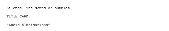
As with many aspects of a film, titling is extremely important. Titling can play a major role in the branding, as well as the feel of a film overall.


Each of the fonts used for the following films have one thing in common despite their visual differences. They are intense, and evoke a feeling of uneasiness in their viewers. This is due to their unsettling appearance, as they are very serious and “in your face”. Macabre fonts such as these are used often within the realm of horror and thrillers and help to give a sense of a film’s content without revealing too much.
Seen above is the title card we implemented into our film. Our editor Ben created it using a font called “DVORAK”. This followed the conventions of horror a lot more, as it appears scratchy and foreboding. We made sure to insert our title card after the sequence ends, rather than at the beginning. This assisted greatly in challenging our viewers expectations for the film. Had the title card been at the beginning, our audience would have started to create their own expectations and meanings for the film, since the font obviously screams “horror”.

The next font Ben used in our sequence is “VCR OSD Mono”. Ben discovered that this was the font used for VHS timestamps, giving the font a more vintage and mysterious feel. This challenged genre conventions a bit, as it is much more subdued and classy than our main title. Since this type of font is generally more ambiguous in meaning, it doesn’t reveal too much about the nature of our film. This font also had a curser overlay, which paired well with the Word document shown at the end.
According to Cambridge, we can use music in our film opening as long as it is credited. As discussed in a past blog post, music can play a major role in constructing meaning and emotion from the audience. This effect was definitely something my group members and I wanted to implement in our title sequence, as well.
Pierce has taken it upon himself to start looking into possible music soundtracks that we can use in our opening. After consulting Ben, Katelyn, and I, we evaluated the options and have decided on “Psycho”- an instrumental produced by a creator named Lucas King on YouTube.
By a landslide, we all seemed to agree that the slow, eerie progression of this piano instrumental was the perfect fit for a film. We came to the general consensus that this song would achieve best in unnerving the viewers, yet also create an eerie sort of calm, as well. Due to the somewhat relaxing nature of the tune, our audience will hopefully be startled at the terrifying presences once they occur on screen- making them feel both deceived by the music and shocked at the same time.
Overall, I’m confident that this soundtrack will create the intended effects we wish to induce on our audience, and I am infinitely more excited to see how it looks once complete.
We have finally completed all the necessary filming for our title sequence and have successfully transferred all the footage to Ben’s computer via flashdrive. It is time for the long process of editing to begin!

To edit, he will be utilizing a software called ‘Sony Vegas Pro 16’. This is one of the best in the business, as even highly regarded editors use this for professional film editing. If you thought this picture looked complex, you’re right- though Ben navigates it like a pro! This software will supply him with all the necessary tools to make our title sequence feel and appear exactly as we imagined it.
Some features of Sony Vegas Pro include: Color Correction, Multi-cam Editing, Masking, Compositing, and Stabilization, as well as several more. Not only does it have many useful tools for video editing, but it has audio editing capabilities as well.
And just for fun, here’s some famous Hollywood films edited using Sony Vegas Pro:
Sources Cited:
Until I started writing this blog post, I hadn’t yet realized just how much technology was used to create our film opening. Today I will detail exactly what we used, as well as it’s purpose.


For the actual filming portion of the project, we utilized both a Canon Rebel T3i camera, as well an iPhone X. The Canon was used sparingly, saving it specifically for more professional shots that could not be captured on the iPhone X. That being said, the iPhone camera was used primarily. This is largely due to the advantageous factors associated with it. The iPhone was more convenient, since the footage was easily transferable from Katelyn’s phone to her iCloud, which is stored on her laptop. Since everyone in our group had a mobile phone, we were able to record from angles, providing us with many options to choose from during post production.

Ben and Pierce were both entirely responsible for recording sound and audio. Each of them utilized a pre installed app located on their iPhones called “Voice Memos”. This app allowed them to record the ambient and diagetic sounds contained within our opening. These sounds include sheets rustling, the photo frame being placed on the counter, as well as footsteps and A/C, to name a few.
Finally, we used industrial lights provided by Pierce’s father to illuminate the curtains and make Katelyn’s shadow appear more visible and intense. This was achieved by plugging it into the wall as I shined them steady on the curtain and someone else filmed. Another device provided by Pierce’s father is the laptop shown at the end of the film. Luckily he had one sitting around that he didn’t mind destroying for the sake of our project. Thank you Pierce’s Dad!
Unfortunately, I could not be present for the second day of filming, however my group has graciously filled me in on what I missed.
It seems that in my absence my group filmed Lionel (Robert) traveling into the other hospital rooms and him interacting with the mysterious figure following him. In addition to this, they also ended up re-shooting some clips from the dummy encounter on day 1 to make it seem less corny and cliche.

After my group filmed everything necessary, it seems they also went down a bit more of an experimental route. They attempted to film, what looked like, Katelyn’s feet levitating off the floor in mid air. This called for an especially interesting method of capturing the shot. You can only imagine my face when they described this to me. See for yourself:

For a better visual, my group showed me this scene from “The Eye” (2008, Moreau, Palud) The scene depicts a paranormal figure levitating off the ground and his feet dragging across the floor. I was super freaked out by this, which meant the scene did it’s job.
The result of this interesting setup! They explained to me the shots will likely not be used, since Pierce’s hair and Robert’s legs kept getting in the frame. Not to mention, physics worked against them as it was difficult to move Katelyn forward in the directions necessary.


Since Mr. Engle has kindly agreed to stay after school with us so that we can get this project complete, we’ve divided filming in to two days. Unfortunately, I won’t be present for the second day, however this shouldn’t be an issue since day 2 of filming likely won’t take as long as day one had.

This is especially since our director, Pierce has taken it upon himself to create a detailed list of shots we’re expected to capture today. This made all of our jobs a lot easier, especially Ben who will use this to aid in compiling the necessary shots during editing. There was little to no confusion on set about what was expected to be filmed that day, as Pierce added us all to a Google Doc we were able to access on our phones.
When we arrived at the room at 2 PM, we immediately began setting everything up. This meant props, getting Robert suited in his costuming and ensuring the room was organized accordingly.
Against our better judgement, we decided to film the sequence of events chronologically. We began first by filming the clock that appears above Lionel’s bed frame. We had to use the Canon for this shot, as Katelyn’s iPhone had been revealing our reflections in the clock.

The first push in of Lionel’s face as he awakens required Katelyn to stand on the bed with the guidance of Pierce showing her how he’d like the shot to look. I commend Robert for being able to keep a straight face because this was quite a funny sight.


In order to create the silhouette we intended to depict in our film, we employed the assistance of industrial lights that Pierce borrowed from his father. Seen in the image above is Katelyn holding the industrial light on the dummy so that he’d appear in the curtain. Katelyn first demonstrated to me how to hold the light correctly and then she began filming it from the other side of the curtain.
Something we learned from our first film experience was that we needed to film on multiple devices so that we could capture the same shots from several angles. As a result, we used Katelyn’s iPhone X (primarily), Ben’s iPhone 8, Pierce’s iPhone 6s and Robert’s iPhone 7. This method worked best in the interest of time since we only had until 5 to film.
As stated in my previous post, we have decided to change the setting of our film as the motel didn’t end up working with what we had envisioned. But fear not! I have already secured a new location for our film, and I feel this one will be even better than the last.

A mock hospital located on my school campus! This is common setting for thriller films and just this picture alone gives off a certain unsettling feeling. It can’t get any better than this! 🙂 I am confident this will establish the creepy vibe we were initially aiming for.
The mock hospital has several different “rooms” which may be useful if we choose to have Lionel explore in the film opening. This will also help as to maintain a realistic feel for the setting.

If the room wasn’t creepy in itself, take a look at these mannequins we found scattered throughout the building. Freaky, right? I’d like to incorporate them somehow, though I’m not sure how yet. I’ll discuss this with our director, Pierce before we film.
Since our film setting will be located at a hospital, Robert’s costuming will change to a hospital gown. Like before, this will make him appear more vulnerable but also depict him as a patient in the hospital. Luckily I didn’t have to go far to obtain this dress, as the room had hospital gowns supplied for us already. I also found some hospital socks, which will make the setting feel more organic and less artificial.
There is one caveat, however. :,) (Yes, everything’s too good to be true) The teacher in charge of this building can only stay until 3 pm. This leaves us with little to no time to film, which is very problematic considering the deadline for our final cut is quickly approaching and Ben will need ample time to edit and evaluate the footage. Mr Engle has offered to stay after school with us until 5 pm to supervise, giving us more time to get all the shots necessary. However, we will still have to split production into two individual days. This is something Mr. Engle advised heavily against, since we may find we have issues regarding continuity, though, against his better judgement, it seems we don’t have much of a choice. Trying to cram production into one day seems too daunting and we risk our footage appearing choppy and rushed. Which, given our first attempt at the opening sequence, is something we’re trying to avoid the second time around.
Hopefully everything goes according to plan this time. :,) Regardless, I’ll post about it but… stay tuned!

After much discussion and reflecting on our rough cut, we have ultimately decided to,,,scrap it and start back at square one. :,) Though inconvenient and painstaking as this may be, (especially this far into the project) we collectively agreed that our rough cut was less than satisfactory and overall, not what we had envisioned for the result of our film. However, this is okay, (I say this now but will probably regret it later) because we recognized the mistakes we made and when all said and done, our title sequence is gonna be more bomb than before. B)
It is important to note , however, that we are still sticking to the roots and skeleton of our film. The plot, characters, and branding will remain the same, and, so will the overall premise. We are essentially just filming in a new location, and making whatever changes are deemed necessary to fit that location.
WHAT IS GOING TO CHANGE:
1: THE SETTING: As enjoyable as the Super 8 Motel was, driving there was a major inconvenience for all of us. The drive itself took 45 minutes to an hour one way and, since *most of us don’t have our own means for transportation, it was up to our parent’s to take us there. (huge shout out to my parents for always being so supportive of our creative endeavors because I’m sure it’s tiring c,: ) Not only that, but the room was too expensive to rent a second time. (It was over $100!!) I haven’t yet decided our new film location, but when I do, that will be detailed in a separate blog post.
2: THE LIGHTING: Another major problem we encountered was the grainy and displeasing quality of the video. Due to our inexperience with the Canon camera, none of us knew how to create an exposure setting suitable enough to record in the dark! Robert’s dark complexion and attire made it even harder to see what was going on, so this is something that will for sure change. However, we would still like to add a blue hue during color correction, so as to maintain the dreamlike vibe we were initially aiming for.
3. THE MEANS OF FILMING: This leads into the next thing that will end up being changed. We used the Canon camera for most of the shots captured, as well as Katelyn’s iphone x. While we still may use the canon for some more advanced shots, we will ultimately use her phone for most of it. We may also use Ben and Pierce’s phone to capture the same shots from multiple angles. This will save us time as well as give us a wider variety during post production.
4: THE COSTUMING: Since we’re likely not going to be filming in a bedroom setting anymore, the next costuming decision will match whatever the new environment is, whatever that will be. The red dress worn by the phantom (Katelyn) may remain, though.
Today in class we were asked to reflect on our rough cuts, then let a friend who hasn’t seen it give us feedback and criticisms. Shown in bold are the questions we were presented with, and below the answers. Here were the results :^)
How much continuity does the video have? Are there any places where the continuity can be improved? How?
The video is lacking continuity in some areas since there are some shots missing which would have provided context. For example, the red cloth which is emphasized in several scenes, yet purpose is never explained or shown towards the end of the film.
To what extent is the video readable as a film opening? Can you understand that it’s an opening? Why or why not? What can you do to make it more readable?
I think it is only somewhat readable as a film opening. so far at least, considering it lacks a lot of elements which would have displayed so. For example a title card, credits, etc. In addition to this, the opening is somewhat convoluted as the story is difficult to follow without the plot being explained.
To what extent is the video readable within your chosen genre? Can you tell it’s a horror/thriller/comedy/coming-of-age etc.? How can this area be improved?
I think it’s definitley readable as a film opening for a thriller as it contains many stylistic elements made for the purpose of making the viewer uneasy. The lowkey lighting, imagery of the static tv, props (pill bottles) to name a few. Not only this but our actor Katelyn played a creepy role in the film which was shown to have provoked a jolt in everyone I showed our rough cut to.
Partner with someone who doesn’t know anything about your video. Record their answers to the following questions:
What is setting (time and place)? How can you tell? Motel, night, due to dark sky and sign.
Who are the characters? How can you tell? Unknown protagonist, and phantom, pictured in the film
What is the movie going to be about? How can you tell? Psychological thriller/ sci-fi horror, ghost of unknown origin is in the film
To what extent is it readable as a film opening? Not very readable, due to no signifying factors (like title cards etc), seems as though it’s just part of the movie.
To what extent is it readable as a thriller film? Very readable due to the appearance and disappearance of the phantom
Overall, how might the clarity of meaning in the video be improved?
Add some title cards to signify it’s the beginning otherwise it is very well done.
Overall, what are your ideas for how the above aspects of the video can be improved? Reshooting? Better editing? Sound? Rewriting parts of the script? What are your next concrete steps? Ambient music, title cards, etc. otherwise very well done
If you thought my mise en scene series was over, you’re wrong. B^) All jokes aside though, today will be the last installment… Lighting.
Lighting was an important factor when filming our title sequence at the motel.
In fact, I’d go as far as saying lighting played the largest role in creating meaning visually.
As production designer, I opted for lowkey lighting, as this would conform to the genre conventions of thriller films, as well as make our sequence appear more macabre. Everyone agreed with this preposition.


Due to the dark environment we were filming in, we required the assistance of several external light sources. Pictured above are me and Katelyn holding iphone lights to cast light on our actor Robert. Pierce, the director, observed in his viewfinder what looked best and instructed us to shift our lights in accordance to that.
However, to our dismay, we found that the Canon we were filming on did not capture images well in the dark. 😦 To remedy the issue we did the only thing we could do.
We got more lights. At one point there was five phones shining on Robert. Pierce also figured out how to increase the aperture on the camera, making the ease of seeing the visual images a lot easier.
Now that we have our footage captured, we will send it to Ben so he can manifest our rough cut. We all decided that a blue light or hue he would add during color correction would best aid in the aesthetic of our film, as well as construct a dream like, or fantasy environment.

Sources Cited

Not like I expected any less, but the room was a total catfish.
And I mean it.
There were unknown stains on the sheets, the carpet was detached from the wall, and certain appliances that were *supposedly* guaranteed with purchase of the room were missing. (For instance, the fridge..the bedroom door etc.)
However, the whole shooting experience was fun, definitley one for the books.

Our Shooting Schedule:
1:00 PM: Pierce Thomas (Director), Katelyn Wagner ( Cinematographer), and Robert Thomas (Actor) are to meet up at Pierce’s house and carpool in Roberts vehicle to the shooting location; a Super 8 Motel in Tampa, Fl.
2:00 PM: Check-in time for the motel room
4:00 PM:Editor (Ben Isaacs) and I are to arrive at the filming location to begin filming. Unfortunately, I had to be at work until 3 so I could not arrive earlier, otherwise I would have.
It should be noted that the check-out time is at 1:00 PM Sunday afternoon, so we can stay as long as necessary to film.
And boy, did we end up using that in our favor, because we ended up staying at the motel a lot longer than anticipated.
In fact, a good 5 hours longer than expected. We stayed at the motel until 1 am.
Would you believe me if I said we still didn’t finish? Because we didn’t. We ran out of time, so we were forced to create an alternative ending to our original script, as well as adjust the script since the room was not as expected.
Though the experience was very educational, I’d be lying if I said I wasn’t worried about the end result of our film sequence. I fear our time spent here will be in vain if the shots look rushed.
Fingers crossed we’re able to put together a decent rough cut, and fingers crossed we won’t have to return to retake the footage. :,)
To star in my film, I proposed to employ Pierce’s brother, Robert. I believe Robert was the most appropriate actor for a film for a variety of reasons. For one, Robert has experience working in theater, so I was confident that he’d be flexible when instructed and given directions to follow. I also felt like he matched the image I had of our main protagonist to a T. My first impression of Robert is that he was serious, stoic, and kind of stone faced. He doesn’t show much emotion. Since our character is trapped within his own mind, haunted by the trauma of escaping death and losing his sister, I felt like his calm demeanor would create an interesting juxtaposition.

Our next actress is Katelyn Wagner, who will be playing the phantom of Lionel’s dead sister and is also the cinematographer in our group. We felt this was most convenient since Katelyn is comfortable around the camera & scheduling would not be problematic. Katelyn also has a very feminine appearance which, again, would provide good contrast to the spooky and disturbing nature of her character’s role.
Though ideal as it may seem, no good film crew spontaneously picks up a camera and begins filming their movie without having a plan. Every good film begins with an idea, where the idea is then developed and fleshed out. This case is no different with our film, Lucid Elucidations. Creating a storyboard will help make things easier during the production stage, sparing us the time we would have spent to figure out which shots we’ll need, and which ones will be scrapped.
After our director, Pierce, created his script detailing his vision for our film, our cinematographer, Katelyn, immediately went to work on developing a storyboard.

Katelyn has prefaced this storyboard with the emphasis that she isn’t an artist, though I think it conceptualizes our ideas for shots quite well. 🙂 The title sequence will begin with a master shot of the setting, followed by a push in on sleeping Lionel and tracking/ midshots of his interactions after he leaves his bedroom. As with everything, this is a loose construction of the shots our title sequence will consist of. This is, of course, subject to change as we may find it necessary to add or subtract certain shots.
Sources Cited:
Throughout the process of filmmaking, we will be utilizing a variety of technology. To shoot, we will be utilizing a Canon EOS Rebel T4i camera that we rented from our teacher Mr. Engle, in addition to our partner Katelyn’s iPhone X to attain shots that aren’t possible on the Canon. To edit, we will use Sony Vegas Pro. The specifications of these technology will be thoroughly discussed in my partner’s blogs, however, I will discuss the condenser mic we will use to record the auditory effects in the film.

The condenser mic we are choosing to use is a “CAD U37 USB Studio Condenser Recording Microphone”. (a wordful, I know). After extensive research (because I am a grandma when it comes to electronics), I discovered that this mic could simply be plugged into my computer whilst I recorded sound. To practice, I recorded my voice, and the sounds of me tapping various objects to gauge the level of sensitivity this mic recorded with. I discovered the mic did well at minimizing background noise (for example from my fan, and loud family) and isolated the main source of what I was recording. This is going to be extremely helpful when we shoot, since ambient and subtle sounds are going to be a major feature of the film. Some sounds I may record consist of: air conditioning, footsteps, tapping, moving bedsheets, dripping water, turning sink faucets, and breathing.

My mic has a sensitivity rate of -40dBV @ 1Pa. This is quite impressive, however, to compare, I searched for the most expensive condenser mic I could find. The result was one over $3,000, called the “Manley Reference Cardioid Microphone Large-diaphragm Tube Condenser Microphone”. Alternatively, this one has a sensitivity rate of 17mV @ 1Pa. Of course, this isn’t necessary in our ~low budget~ film, but it did provide some insight as to the importance of recording professional sonic effects in film.
Sources Cited:
Determining the general location for our film was less difficult than narrowing it down to one specific place. I was conflicted at first between using a motel, a hotel, an upscale suburban house, or a dilapidated home. Since these locations are all very similar , I had to seriously consider the impression and effects that each setting would leave. It was incredibly important that I choose a setting that complimented the plot and nature of our film accordingly.

A nice hotel setting or a suburban home may leave the impression of organization and formality, depending on it’s cleanliness. Whether or not I choose to establish a juxtaposition between the messiness (or cleanliness) is an important factor to consider as it may help reveal certain aspects about our protagonist, Lionel’s, personality or mental state. For instance, a messy or disheveled setting might imply our character is feeling manic, stressed or simply unhygienic. (This would all corroborate with the aforementioned presence of his head trauma/ mental illness) This would be characterized through the use of props such as having an unkept bed, or trash scattered throughout the room. Although this idea was plausible and could absolutely apply to the protagonist , I ultimately ended up ruling out the locations of the nice hotels considering their price point of 200-300 dollars a night. This would’ve been especially impracticable in the circumstance that we needed to come back for retakes or extra footage.

The next setting I ruled out were the dilapidated homes or the disconcertingly dingy motels. Since our character is not supposed to be obviously ill, this did not seem like the proper fit anyways. Not to mention, there was a general consensus among my group that some reviews of the locations I evaluated were shady and…dangerous to say the least. Of course, the safety and comfort of my group members and I was my first priority so this elimination was a no brainer. However, that didn’t make reading the reviews any less amusing.
Here’s the tip of the iceberg:


What I ultimately ended up choosing was a healthy medium of the previous options. A somewhat budget friendly motel located off the side of a highway with a modern touch. This room ended sealing the deal for me for a variety of reasons.

This motel’s main selling point, to me, was not only it’s dull and simple color pallette, but it’s atypical motel room appearance. The bedroom being located in an entirely different room from the living space makes it appear more like a small apartment rather than a motel. This will also help to preserve continuity between scenes and allow our character to move fluidly throughout this space. It isn’t too cramped but it is also not too spacious.

Since most of our title sequence will be filmed in the bathroom it was especially important to me that it possessed a suitable layout and the amenities necessary. In this case, the bathtub, which will act as the focal point of the title sequence.
I’m not going to lie, finding a hotel with the bathroom I envisioned for my title sequence was especially difficult, as some motels did not even provide photos of them and others were extremely cramped. I was beginning to grow discouraged and even considered filming the bathroom separately at a friend’s house instead of at the motel room. (This spawned a series of text messages from me asking my friends to send pictures of their bathrooms, definitely a request I hadn’t anticipated making) While this wouldn’t have been impossible, it would have likely created a conflicting time constraint on us considering everyone in my group has differing schedules and I have work practically every weekend. Finding this motel was particularly convenient since all our shooting will occur in one location.
The fun part! Props! As discussed in my previous post regarding costuming, it’s no secret that I’m only a high school student with little wiggle room in terms of my budget. This meant that during my endeavor to find props, I had to find props that were either really cheap, or, ideally, that I had owned already. So yet again, I hit up my local Goodwill and Salvation Army. :^)

Asides from costuming, I hadn’t walked into this with much commitment to the props I had in mind, considering thrift shops are like a box of chocolates. You never know what you’re gonna get. 🙂 I didn’t want to be disappointed if the shops I visited didn’t have the specific items I was looking for. Though, I can say I was pleasantly surprised upon my search.
Pictured above are an array of items that I managed to neatly pack into one suitcase. Contained inside are: pill bottles, an old corded telephone, a photo frame, alcohol bottle caps, and books.
The center piece shown in the first photo are yellow flowers. Though I thought they were pleasing visually I also decided to look into the implications of the color yellow if I chose to purchase these for the film.
What better fit, huh? Since our protagonist Lionel will be portrayed as being mentally ill , but alright on the surface, I felt this was only appropriate. In addition, his guilty conscience over the death of his sister would help apply to the symbolism of cowardice it can portray. This isn’t to say the flowers will only symbolize negativity, however. Perhaps it can be implied Lionel was given the flowers as a gift to cope with grief, the bright colors can light up a room and improve his mood.
Moreover, the pill bottles and bottle caps are simple touches to emphasize Lionel’s progression into madness and instability. The photo frame shown on top will later have a photo of Katelyn and Robert inserted inside, as a means of visualizing the pair’s relationship to our audience and provide some context.

Of all the props I had scavenged, these were for sure among my favorites. Though the books likely won’t play a huge role in themselves, I thought they matched the imagery and branding of our film eerily well. Not to mention, their old, outdated, appearance and yellowing pages make them look super creepy.
Sources Cited
Since I’m in charge of production design, I was ultimately tasked with the responsibility of developing costuming plans for our actor, Robert. Of course, I don’t have as large of a budget as a major film studio, so I decided to resource my local thrift store, aka Goodwill. 🙂

For our film, I knew that our protagonist would be in a position of deepened vulnerability, given his disoriented mental state after experiencing major head and psychological trauma. I also knew that we’d be filming in the location of a motel, more specifically, our character’s bedroom. This consideration eventually led me to conclude that pajamas would be the most appropriate fit for the feel we were intending. Not only do pajamas make him appear more vulnerable and unprepared, it would also make sense, since he’ll likely be awakening from sleep and people normally rest in some kind of sleepwear. (duh)

After searching the store up and down and consulting my teammates for their opinions, I finally decided to choose the pieces shown above. Not only do they match well together, I also figured they would look complimentary on our actor. Unfortunately, I was unable to find a robe that was in a lighter color than navy blue, so I hope that it won’t be problematic in the darkly lit environment we will be filming in. In the worst case scenario, we will have to scrap the robe, though I have my fingers crossed it won’t come to that point.
As promised in my previous post, here is the update on our script which is finally finished! Of course, this is subject to change as things might be extracted or included during the post production phase. This wonderfully written script was done by our group member Pierce Thomas. Given his exemplary talent in imaginative writing and storytelling, we felt that this task suited him appropriately. 🙂 A link to his blog will be listed below!
Pierce’s Blog: http://elucidation.home.blog
Surprise! Blumhouse has decided to finance us! I believe this production company will help us to achieve the most satisfactory product in our film opening and I am thrilled (get it? cause its a thriller?) to begin filming! (c:

Cheers to Blumhouse! 🙂 Let’s secure this bag 😤💰
attached below is the transcript for our film pitch video!
Our Plotline:
OUR FILM, LUCID ELUCIDATIONS, IS A MYSTERY/PSYCHOLOGICAL THRILLER FILM THAT FOCUSES ON ONE MAN WHOSE PAST IS UNCLEAR AND HIS SURROUNDINGS EVEN MORE SO. HE DOESN’T REMEMBER WHO HE IS, LET ALONE WHAT HE DID. HE CAN’T REMEMBER, BUT HE NEEDS TO – AT LEAST, THAT’S WHAT THE VOICES KEEP TELLING HIM. HE’S A PRISONER OF HIS OWN MIND AND THE FANTASIES AND ILLUSIONS IT WEAVES, CAUSED BY HEAD TRAUMA, INJURIES THAT LANDED HIM NOT ONLY IN THE HOSPITAL, BUT ALSO A MENTAL FACILITY. IN A WORLD WHERE THE LINE BETWEEN FANTASY AND REALITY IS INDISTINGUISHABLE, THIS FILM EXPLORES THIS MAN TRAVERSING THROUGH HIS MEMORIES TO FIGURE OUT THE TRUTH. NOT ONLY WHAT HE SUPPOSEDLY DID, BUT ALSO WHAT HIS MIND IS TRYING TO SHOW HIM.
Our Chosen Production Company
WE’VE CHOSEN BLUMHOUSE STUDIOS AS OUR PRODUCTION COMPANY GIVEN ITS SPECIALTY AND EXPERIENCE PRODUCING QUALITY HORROR FILMS ON A GENERALLY LOW BUDGET. BLUMHOUSE HAS PRODUCED MANY SUCCESSFUL HORROR FILMS SUCH AS GET OUT (2016), THE VISIT (2015) AND HAPPY DEATH DAY (2017). ALL OF THESE FILMS ARE SIMILAR TO OURS THEMATICALLY IN THE SENSE THAT THEY APPEAL TO THE VIEWERS SENSE OF UNEASINESS AND CONTAIN PSYCHOLOGICAL ELEMENTS THAT PERTURB THE AUDIENCE.
Our Requested Budget
FOR OUR FILM WE WILL HAVE A LOW BUDGET OF APPROXIMATELY $5,000,000. WE DECIDED ON THIS NUMBER AFTER RESEARCHING SIMILAR THRILLER FILMS PRODUCED UNDER BLUMHOUSE PRODUCTIONS, SUCH AS GET OUT AND THE VISIT , WHOSE BUDGETS WERE APPROXIMATELY $5,000,000 EACH, AND TRUTH OR DARE, WHOSE BUDGET WAS $3,500,000. WITHIN THIS BUDGET, WE WILL NOT BE SPENDING IT TOWARDS BUYING THE RIGHTS FOR THE SCRIPT AS WE WILL BE WRITING OUR OWN. HOWEVER, WE WILL HAVE TO SPLIT OUR BUDGET AMONGST OTHER FACTORS, SUCH AS SALARIES FOR THE CAST AND CREW, CAMERA EQUIPMENT, COSTUMING, MAKEUP, PROPS, SET CONSTRUCTION, AND ANY POSSIBLE TRAVEL FEES SUCH AS HOTEL RENTALS, GAS, ETC., TO NAME A FEW.
Distribution
AFTER EXTENSIVE RESEARCH INTO WHICH DISTRIBUTION COMPANY WOULD BE BEST FOR OUR FILM, ‘LUCID ELUCIDATIONS’, WE HAVE A FEW POSSIBLE OPTIONS FOR WHAT WE WILL CHOOSE. WE FIRSTLY WILL PREMIERE OUR FILM AT SUNDANCE FILM FESTIVAL, WHERE THERE IS A CHANCE FOR THE MOVIE TO BUILD A REPUTATION AND CREDENTIALS, SUCH AS AWARDS OR PRAISE FROM CRITICS. OUR CHOSEN PRODUCTION COMPANY, BLUMHOUSE PRODUCTIONS, HAS A 10 YEAR “FIRST LOOK” DEAL WITH UNIVERSAL PICTURES, ALLOWING UNIVERSAL TO GET THE FIRST GLANCE AT ANY NEW WORK FROM BLUMHOUSE PRODUCTIONS AND DECIDE RATHER OR NOT THEY WILL APPROVE OF THE FILM OR NOT. IN THE CASE UNIVERSAL PICTURES DOES NOT APPROVE OF OUR FILM, WE CHOOSE A24 FILMS AS OUR SELECTED DISTRIBUTION COMPANY, AS THEY HAVE PRODUCED FILMS THAT FIT INTO A SIMILAR GENRE AS OUR FILM, SUCH AS ‘THE WITCH’ (2015) AND ‘HEREDITARY’ (2018), WHICH ALSO HAVE SIMILAR BUDGETS TO OUR FILM, AS ‘THE WITCH’ HAD A BUDGET OF $4 MILLION USD AND ‘HEREDITARY’ HAD A BUDGET OF $9 MILLION USD. DUE TO THE FACT THEY HAVE MADE LOWER BUDGET FILMS SIMILAR TO OUR GENRE, WHICH WERE VERY SUCCESSFUL (‘HEREDITARY’ GROSSED $44 MILLION USD WITH A $9M BUDGET), WE FEEL AS IF THEY WOULD BE OUR NEXT BEST CHOICE OF DISTRIBUTION COMPANY.
There are several modes of exhibition a film can undergo, but generally, they are distinguished between two main roles: theatrical, and non theatrical release. We have decided our film will experience both types of exhibition, so that we can gain the viewing-ship for both audiences they tend to accumulate.

Theatrical release, is, in layman’s terms, a movie that is shown in theaters for wide release. It is generally quite expensive to have a movie shown in theaters, so we would have to ensure our film is marketed and advertised well so as to prevent financial losses. The movie theater pays an average of about 50-55% of its ticket sales to the movie studio as film rental fees, of which the percentage decreases as the duration of a film’s showing continues. This is done as an incentive to theaters to keep movies in the theater longer. Our film will be presented for about 4 weeks.

The next method of exhibition is considered non theatrical release. This includes anything from streaming, (such as Hulu, Netflix etc.) home video, and cable. This will an effective way to distribute our film, as the popularity of digital streaming has become increasingly apparent over the last few years. In a poll conducted by CNBC of 801 Americans around the country, the results showed that 57 percent of the public has some form of streaming service, 60% of which who use Netflix. Having our film made available from the comfort of one’s home will be very effective in creating more popularity for our film.


One last method of non theatrical exhibition includes displaying a film at a film festival. This is done before a theatrical release and will not only give some the opportunity to see the movie early, but give critics the chance to review our film. If the reviews are positive, it will accumulate hype for the movie’s theatrical release, ensuring that it is a hit at the box office.
Sources Cited
“Branding” is loosely defined as “the overall experience of a customer that distinguishes an organization or product from its rivals in the eyes of the customer.” Immediately when I think of branding, I think of multi-million dollar companies such as Apple, Samsung, and the like, followed by their associated reputations. For instance, Apple is known for their exemplary camera quality, and Samsung is known for their innovative phone technologies. In order to make our film stand out in theaters we must ensure we have a solid understanding of our individual brand, since the impression our film leaves on the consumers will, ultimately, determine it’s success.

Though my group and I have not yet decided what the branding of our film will be exactly, we do have some ideas. For one, we would like to incorporate imagery of water, eyes, and jarring colors, such as that of the pastel ones shown in our film poster shown here. This poster was created by our editor, Ben Isaacs, with the intention of inducing a creeped, almost uncomfortable feeling. I feel this was achieved well, and could definitely be a great marketing technique in advertising our film and establishing meaning within the film itself.

Seen above are the various movie posters that have been released for the upcoming movie “Us”. It can be seen that the movie characterizes itself through the use of a consistent color pallet (reds, whites, and blacks) , title font, and imagery. (eyes, scissors, shadows, ink splots) Additionally, the poster includes the name of it’s director, Jordan Peele, who is famously known for his success with the movie “Get Out“. Since Peele has developed a reputation for producing innovative horror films, people are going to be more encouraged to see the film than if it was a lesser known director. These are all examples of film branding that will influence us to see the movie and distinguish it from others on the market.
Sources Cited:

In order to perfectly construct my film I have decided to review one of my favorite thrillers of all time from the beginning of it’s production all the way to it’s final execution. Without further a do, let’s begin! :0

History/ Target Audience
Saw 1, released in 2004, began as a seven minute short film directed by James Wan and written by Leigh Whannel. The short was pitched to Lionsgate and with roaring approval, the pair was granted a small budget of 1 million dollars to make what is now known as one of the highest grossing horror series of all time.
Production
The most incredible part of Saw’s production was perhaps it’s ability to work wonders with it’s severely limited resources. The film consisted of only three actors (one of which was the scriptwriter himself, Leigh Whannel) and was shot in only one location. This location, a dingy run down basement was not only arduous on the actors, but Wan as well as the scheduling constrictions were extremely tight. This resulted in shoots that lasted as long as 12 hours on a typical day. The film was shot in 18 days and there were no rehearsals for the actors, rather, the rehearsal takes were actual footage for the film. Wan explained that the style instead ended up being “more gritty and rough around the edges due to the lack of time and money that we had to shoot the movie with” but that it ultimately worked to their advantage as it became the aesthetic of the film.
“It was a really tough struggle for me. Every day, it was me fighting to get the shots I did not get. I had high aspirations, but there’s only so much you can do. ”
James Wan
“We did a lot of things to fill in gaps throughout the film. Whatever we cut to newspaper clippings…surveillance cameras, or we cut to still photography within the film, which now people say, ‘Wow, that’s such a cool experimental style of filmmaking’, we really did that out of necessity to fill in gaps we did not get during the filming,”
James Wan
Distribution
After having it’s praises sung from Lionsgate, the film was distributed to Sundance Film Festival, where, a few days later it was premiered for 3 days in a packed movie theatre. Lionsgate had originally intended to release the film direct to video, but due to the positive reaction at Sundance, they chose to release it theatrically by Halloween. Initially, the film received a rating of NC-17, but after further evaluation, was rated R for it’s graphic and disturbing content, and exploitation of violence. Saw opened at #3 on Halloween weekend 2004 in 2,315 theaters and grossed $18.2 million, behind Ray, which earned $20 million and The Grudge ($21.8 million). According to Lionsgate’s exit poll, 60% of the mostly male audience was under 25 years of age.
Marketing
Ironically enough, the release of Saw came with the emergence of the “Give Til It Hurts” blood drive by Lionsgate which benefits the Red Cross. Donating blood for this event came with the reward of receiving tickets to see the film, which is an incredibly clever marketing technique on their part. With each release of a new Saw movie, the blood drive ran back up creating a tradition which would later characterize the series as a whole. Moreover, the release of the Saw’s trailer “teased and pontificated but gave away as little as humanly possible in terms of actual plot or visual spoilers. ” This created an highly regarded sense of anticipation for those who hadn’t gotten the chance of viewing the film at Sundance.
Cross Media Convergence and Synergy
Since Saw was released in 2004 and began as an indie film by two largely unknown people, the film was not designed to have received as much praise as it did. It received a mix of responses from critics, some comparing it’s excellence with that of “Se7en” (Fincher, 1995) and some going as far to claim it was “convoluted” and “carelessly underscores its own shaky narrative at every turn with its mid-budget hokiness.” After it’s theatrical release, it was made for DVD.

Sources Cited
Since the making of our title sequence requires a strong grasp of how setting and plot are brought to life via our imaginations and then directly to the big screen, a script seems to be an obvious yet essential tool to aid in doing so. This will not only provide guidance as to the direction and pacing of our film, but help to sort out our ideas in an organized fashion so that we are prepared for shooting. As such, I have decided to dive into the nuances of script writing and will outline what exactly makes for a good script. Attached below is a general outline for the format of a professional film script.
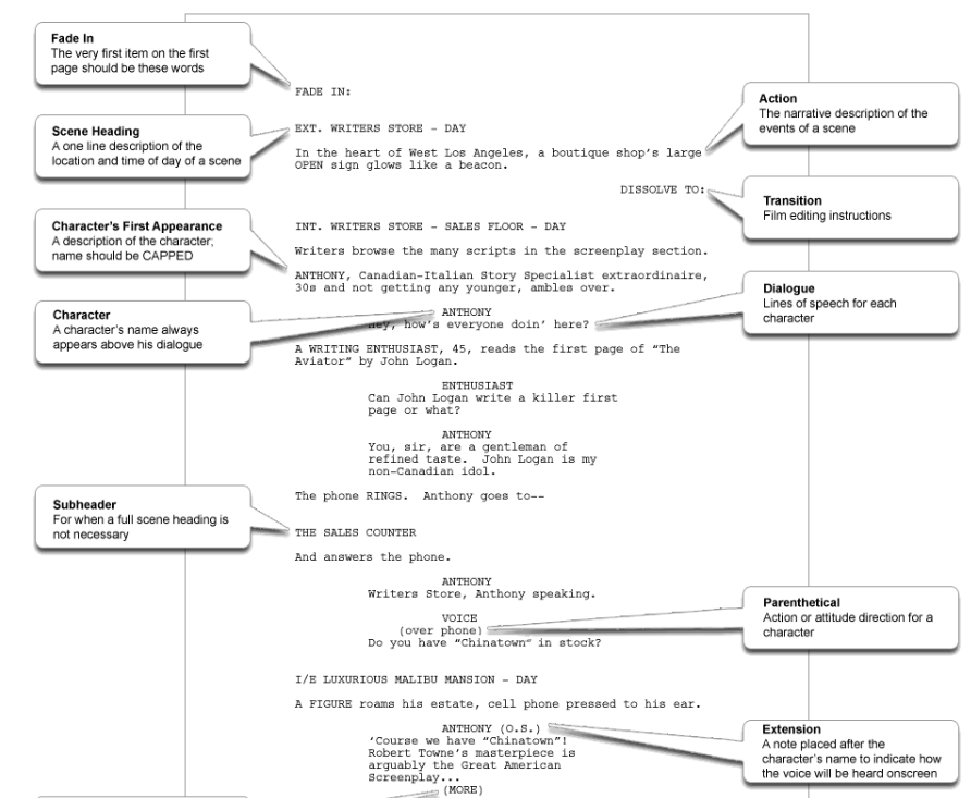
Based off this example, an important characteristic of scripts seems to be its use of sensory details and emotive language to create a distinct vision of the atmosphere and scene. In addition to this, there are a direct statement of events detailing the character’s dialogue and mannerisms. (ie the capitalization of character names followed by their dialogue directly below) This contradicted my initial impression of a script, which I thought consisted of dialogue exclusively. After doing research I also discovered that a formatted script page in Courier font equals roughly one minute of screen time. Based off this estimate, we will try to limit our script to 2, possibly 3, pages maximum.

My group and I have not yet begun the process of writing our script (T^T) , however, I would imagine that based off our discussions regarding the plot it would probably look something like this:

Again, this is just an example of what our script could entail and was made mostly for the purpose of generating practice and understand of the specificalities associated with scriptwriting. It is unlikely that the script will remain this way and of course is subject to change as our ideas shift. It goes without saying, when the official script is written I will be sure to blog about it. 🙂
Sources Cited
Since our film will be produced under a generally low budget it is important we choose a production company that caters to these requirements accordingly. The production company we choose will have a significant impact on how our audience engages with our film as well as the attention it may or may not receive. Before my group and I can come to a decision, I must evaluate our options.

The first production company my group and I are considering is A24. This company is one which specializes in indie films and have created movies across a wide spectrum. To name a few, Hereditary (2017), Moonlight (2016), and Lady Bird (2017). Budgets for A24 tend to be around 5- 15 M USD. This is a considerably high budget for an independent company.

The second is Blumhouse Studios which is organized and managed by Jason Blum, an Academy Award-nominated and two-time Emmy and Peabody Award-winning producer. This company specializes in “micro budget” horror films and has made numerous hit movies such as Get Out (2017) Halloween (2018) , and The Visit (2015). Blumhouse’s most trademark movie, Paranormal Activity, was created for 15,000 and grossed over 200 million worldwide. Blumhouse has a 10 year deal with Universal Pictures, which, if chosen, would give our film an opportunity to gain more publicity. Since Universal is reputable and known for putting out good movies , people will be more inclined to see our film.
Sources
Since researching thriller films more in depth, I’ve discovered a commonality in each one tends to be it’s dependence on sound to evoke emotion and build the suspense that will serve as the backbone of the film. It seems that in order to make the film effective, the sound must be equally as powerful as the images on screen.
Of course, Spider-Man is no thriller film, and Peter Parker is no Hannibal Lector, but this video perfectly demonstrates how crucial of a role sound plays in creating emotion. As I’m sure many others can relate, watching this video made me extremely uncomfortable and it didn’t do much asides from strip the clip of music and heighten the cacophony of ambient sounds. Silence, for whatever reason, is incredibly unnerving.
“Beginning at infancy, the constant media soundscape has provided the background noise either side of bassinet, kindergarten, school and university. It is little wonder many of my students feel agitated and ill-at-ease when there is not at least one portal providing background noise. ”
Bruce Fell, Lecturer, School of Communication and Creative Industries, Charles Sturt University
In a study conducted by Bruce Fell a professor at Charles Sturt University, the eeriness of silence was investigated in 580 undergraduate students. It was reported that most students grew up with ambience of TV or radio and thus groomed with background noise throughout their entire life. The study suggests that being accustomed to constant sound makes the absence of it uncomfortable.
“The lack of noise made me uncomfortable, it actually seemed foreboding”, observed one student. Another said “perhaps, because media consistently surrounds us today, we have a fear of peace and quiet”.
Sources Cited:
After evaluating some title sequences in the horror and thriller genres, I realized that many rely on music, or a soundtrack to progress the events occurring onscreen. Take, for example, the title sequence for The Ring (Verbinski, 2002)
The opening opens immedietley with a lullaby like tune, something used commonly in horror film openings. This choice in music is typically used to juxtapose their conventional purpose of relaxing children. In this case, the tune does the opposite, instead raising the hair on viewers necks and practically screams something menacing is to come. However, the music gradually picks up pace, by the end becoming extremley aggressive and harsh. This is accompanied by the disturbing imagery displayed on the screen.
Though we aren’t too sure whether or not we’d like to include music in our film opening, I felt like it’d be interesting to take a look into some possible ideas!
2. These Boots Are Made For Walkin’ by Nancy Sinatra. I’ve seen this song used in a few different films before! (Fullmetal Jacket, Oceans 8, Dynasty..etc.) Not only does the old- timey bass line run shivers down my spine, but I felt this song could easily be used to portray the perspective of a villain. (This would challenge a genre convention as well!) It gives me an empowering vibe, one that is almost sinister. I think a horror film from the perspective of the villain would definitely be an interesting approach!
3. Yet another iconic song! Paint it, Black by The Rolling Stones! As with the previous song, I feel this song could work incredibly well at establishing a sinister vibe and creating almost a “theme song” for a villain or antagonist. However, for this song at least, I think an instrumental may work better so as not to distract from the content of our opening.
Since my group and I haven’t yet determined whether or not we’d like to incorporate a song/ score in our film opening, I’ve taken it upon myself to research the purpose of music and the effects it would create.
The first film, created in 1895, was as a silent film, a movie with little to practically no sound whatsoever. It wasn’t until 1927 that the first film with sound emerged, and even then, many filmmakers had not yet adopted this means of technology yet.
That being said, in a world consumed by digital media, many consider music and scores an essential part of a cinematic experience. So what makes it so important?
Take this scene from Baby Driver (Wright, 2017) for example:
In just the 1 minute and 39 seconds this scene lasts for, many things happen. Just to name a few, Baby and his team arrive at the scene to rob a bank, they escape the bank, a police officer arrives, the police officer is shot, and Bats (a member of their team) dies after Baby floors it into another vehicle. The song, Intermission by Blur, begins slowly until it gradually builds up speed and pace in accordance with the events that occur. This scene would not have been the same without music and that’s for sure. It plays a critical role in building the tension and suspense observed in the scene. From the uncertainty regarding whether the team will be successful in their bank heist to the panic that arises at the first sight of the police officer, this song appears to hit the mark incredibly well.
Sources Cited:
Finally deciding on a genre begs the question of this: who will our film be oriented towards? This is an important factor to consider given the success of our film is entirely dependent on our audience, the people who would be investing their time and money into our film. After some extensive research, this is what I discovered 🙂


Given the graphs above, it is obvious that thriller movies tend to perform well at the box office – receiving fifth place overall in film genres and have a very versatile audience range. 83% of the participants who voted their favorite genre as thrillers were female and 84% were male. This correlation shows that regardless of the content, our film will likely appeal to a wide range of people. However, given the mature content and themes consistently prominent throughout thriller movies, our movie will not appeal to younger audiences. Since thrillers sometimes contain imagery of psychological disorders, violence, and death, younger audiences may find it too disturbing.

In order to perform well at the box office, our film must be versatile and appeal to a good range of people. Since 13 -24 is the age group that which cinemas experience the most volume, our movie (if given a rating) would receive that of PG-13. It will contain some sensitive themes, but nothing explicit enough to require an exclusively adult audience. This rating will practically guarantee the success of our film and ensure that we profit off it. Off the same coin, our film will be advertised appropriately in order to effectively represent the nature of the film. Since ages 13-24 are known for being technologically savvy, the film will be advertised across multiple social media platforms such as YouTube, Instagram, and Twitter.

Sources Cited:
After much debate and discussion, my group and I have finally decided to move forward into the direction of the thriller genre. We felt this was most appropriate as the film “Lucid Elucidations” will likely encompass some psychological elements that unnerve the viewer rather than scare them. Moreover, today I will analyze Netflix’s ‘Bird Box’ that was released in December of 2018. This film is categorized as a horror, thriller, and drama, a perfect example to research. 🙂

The scene opens with the imagery of water, more specifically an aerial shot of river rapids. This choice of scenery is something that poses significance later in the film as it is the character’s means of reaching sanctuary. This is revealed using offscreen Malorie describes the journey through the rapids as something that will be extremely difficult, and similarly just as dangerous, easily resulting in death if Boy & Girl take off their blindfold, speak, or don’t follow her directions. Right off the bat, the movie creates a juxtaposition between the typical symbolism of water (life, purity) and the established meaning that the movie produces. (danger, death, and destruction.) Twisting what is typically perceived as normality appears to be a common convention of thriller movies that I’ve noticed, and definitely something I will keep in mind as a possibility for my film.
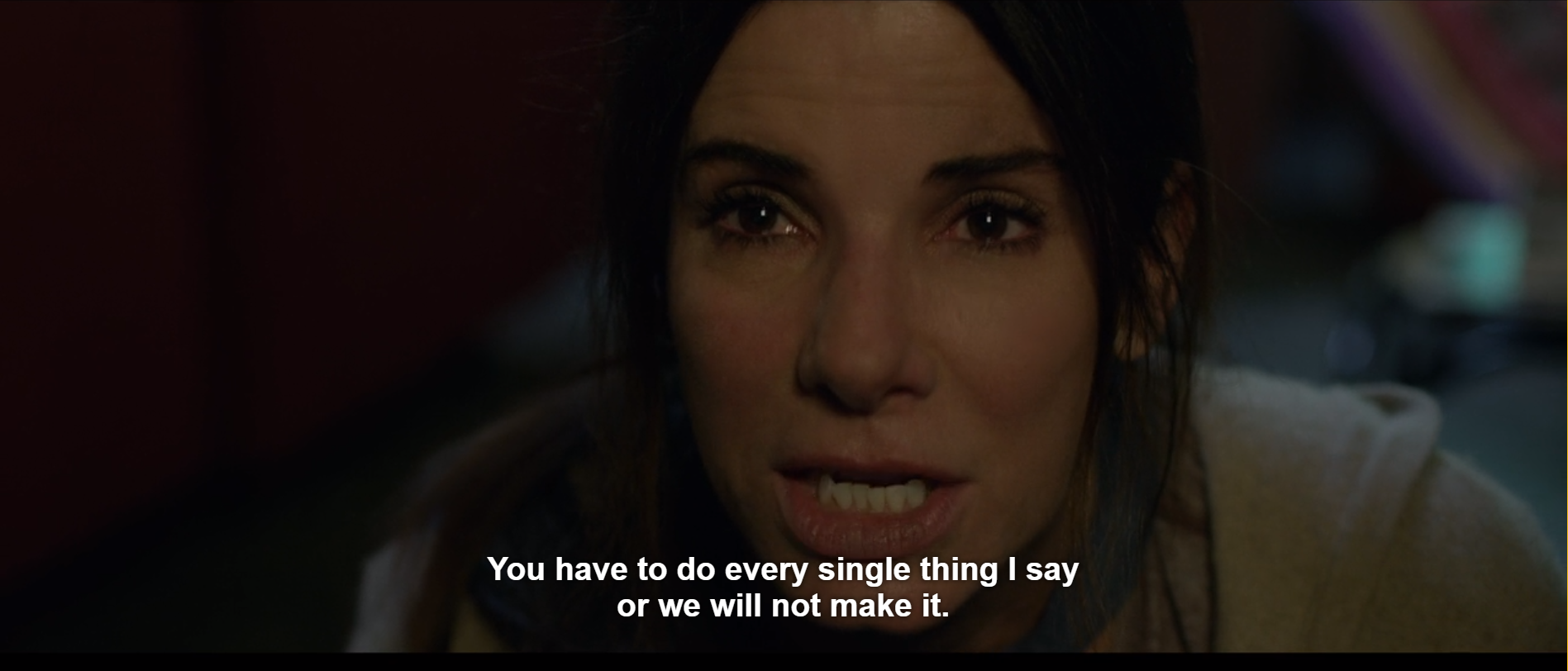
Following the long takes of the rapids, we are then met with close ups and extreme close ups of Malorie urging *quite aggressively* for the kids to follow her instructions, considering their lives depend on it. The scene stalls on Malorie’s face for quite a long time; this is done for the purpose of inducing intimidation from the audience and establishing the intensity of the scene. This inserts the viewers into the action and makes us feel as if we’re being spoken to directly. This also helps to emphasize Malorie’s emotions as makeup has obviously been manipulated to make it appear she’s been crying , or at the very least in distress.
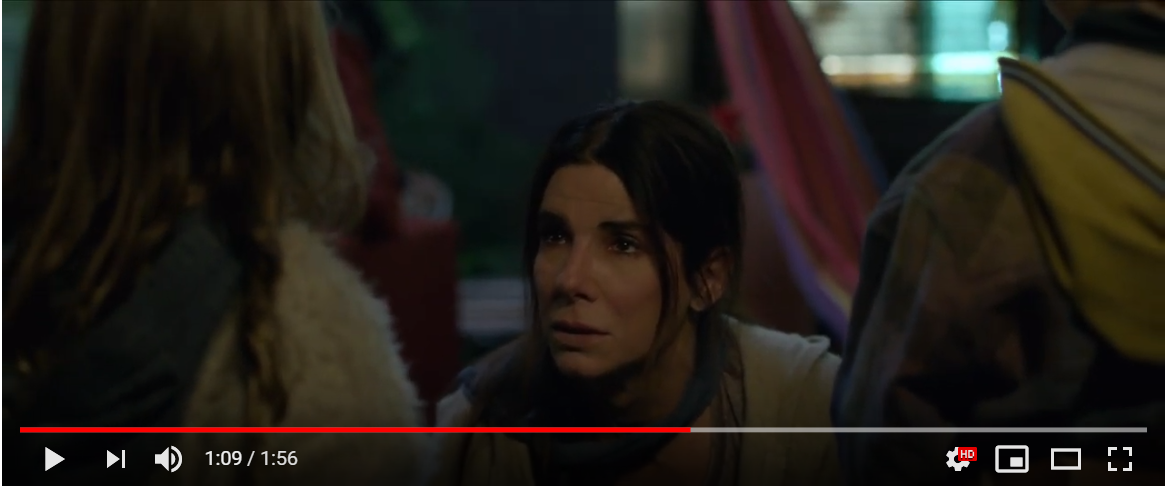
Here we see a three shot of Malorie the kids. Group shots tend to represent strength in unity and this scene is no different. Despite Malorie’s abrasive nature this emphasizes the importance in teamwork and the significance in establishing that they are all on the same page. There is shallow focus implemented in the background and deep focus on the characters which again represents that they are all tuned into the conservation and focused on Malorie’s instructions.


In order to effectively represent my genre, it is absolutely crucial that I have a solid understanding of the film conventions, methods of cinematography, and patterns that add up to make a good horror film. In which case, what better movie to investigate than the horror classic ‘It’ which earned over 700.4 million USD in the box office?

Much of the opening sequence for It contains crosscutting, an editing technique used with the intention to direct the flow of conversation- in this case the conversation occurring between Georgie and Pennywise. Here, a low angle shot is employed to emulate Pennywise’s perspective from the sewer. This is ironic, considering low angle shots typically place the viewer in a place of inferiority and weakness. Obviously, Georgie’s timid and innocent persona does not evoke this kind of emotion.

In contrast to the shot discussed previously, we are now immersed into the event from Georgie’s perspective. This is done through the use of an over the shoulder shot. Much like before, there is a paradox present here in using a high angle shot as it places the subject into a position of inferiority. Clearly, Pennywise is not the victim in this situation.

Like most horror films, close ups are present throughout to aid in producing and demonstrating fear.
In addition to this, lowkey lighting, specifically chiaroscuro lighting is used to manipulate the shadows on Pennywise’s face. This makes him appear scarier and intimidates the audience. (unless of course you’re weird and clowns don’t scare you sMh)

After Pennywise tears Georgie’s left arm off, the balance of the camera angles are suddenly shifted. Unlike before, the viewer has now been removed from the action and instead immersed into an omniscient perspective of the event. We are now observing the scene through a crane shot of Georgie lying helpless on the pavement. The camera begins to shake violently (also known as a canted angle), thus disorienting the viewer and simulating the panic/ distress being experienced by Georgie. Not to mention, Pennywise’s hand barely creeping into the frame makes this all the more disturbing.
My group and I are debating whether we would like to push our film more into the direction of horror or thriller. In today’s post, I will outline some conventions of each genre so I can better determine which one I would like to choose!

Themes tend to revolve around:
Horror movies tend to follow a chronological sequence of events and have lots of foreshadowing sprinkled throughout to create a sense of apprehension and fear. There is typically defined hero and antagonist roles, followed by many characters who are victims of the antagonist. (Usually uses the stereotypes of teenagers, young women, police/ authority figures)
Settings Used:
Mise En Scene

Since thrillers are a subgenre of horror, a lot of the genre conventions tend to collide. It is the subtle nuances, however, which sets them apart.
Thriller movies are mostly defined by the emotions they elicit from the viewer, i.e: heightened senses of anticipation, suspense, anxiety, and alertness. While horror movies main purpose is to scare, thrillers usually tend to make us more uneasy.
Some common tropes of a thriller film include:
Sources Cited:
– Thriller-Codes-and-Conventions-provided-by-Cross-Sectoral-Teachers-2017 – https://1drv.ms/p/s!AtW96RnwgcyfhQICNmhUxWjaPpna – https://www.filmsite.org/thrillerfilms.html – https://prezi.com/_bkrwwzfisyh/codes-and-conventions-of-the-thriller- genre/The importance of font and color !

I don’t think I even have to say it but I will: comic sans doesn’t work in any scenario, especially not horror! After creating this abomination I know that now. x( In any case, titling is extremely important for setting the image of a horror movie. In most horror movies, they appear to use large fonts in any variation of deep red, grey, white and black. Sometimes the font appears to emulate handwriting, blood splatters, or typewriters.


The Evil Dead (1981) title text utilizes angles and edges to portray the struggle and dichotomy between victim and villain. The font is intense, putting viewers on edge in combination with the disturbing image of a young woman fighting for her life. The letters ‘V’ and ‘A’ are extending much further than any of the others, representing an attempt at escape from the limits of the borders.

Alternatively, the title font for the movie ‘Carrie'(de Palma, 1971) utilizes a more minimal approach. This is in direct contrast with the powerful imagery displayed in the photo. A young girl covered in blood standing in the midst of flames. This picture induces fear and makes audiences wonder what the girl is capable of.
Overall, title fonts are essential to a viewer for various reasons.
Typography can:
Sources Cited:
For today’s post, I’ve decided to do an analysis of the opening sequence from It Follows, a film directed by David Mitchell (2014) . I’ve chosen this excerpt as the movie encompasses a variety of genres: horror, mystery, and thriller. Not only that, but it appears to contain the many aspects of horror/ thriller films that I intend to implement into my title sequence. 🙂
First and foremost, I noticed that the opening doesn’t leave much room for discovery. The sequence reveals practically nothing, while also managing to keep the viewing audience on their toes, enthralling them into this terrifying but purposely ambiguous storyline. This is something I’d like to incorporate into my film to prevent it from being too trailer-esque while also maintaining a strong sense of mystery that interests my viewers.

The cinematography is not very extensive in this scene, in fact, it’s actually quite limited as it is done almost entirely using wide shots, push in/outs and tracking shots. However, this seems to work to it’s advantage, as it appears to isolate the protagonist (who is later revealed to be named Annie) and sets the tone of apprehension as we expect the off-screen threat to draw closer to her. This fear of the unknown is a reoccurring theme that shows to be especially effective not only here, but throughout the entire course of the film as well. In addition to this, the title sequence uses ambient sound and heightened diagetic sounds to further emphasize the foreboding and menacing vibe of the film. In parts, the sound, or lack therof, makes the audience anxious and engages a stronger sense of suspense and eeriness.


Moreover, mise-en-scene plays a huge role in assisting to create the vibe of the film. For one, a dark and dull color pallette is used, accompanied by low key lighting to induce uneasiness. The costuming , high heels and undergarments, put the protagonist into a position of vulnerability and immediately establishes her as the victim in this narrative. This touch may also be used to illustrate how women are often represented in horror films: weak, unprepared, and most commonly, as the victim. Given this films success of $14,674,076 of domestic total gross, by investigating the conventions that made it effective, I can hopefully apply this knowledge to create a similar effect! 🙂
Sources:
In essence, a title sequence can introduce the viewer to the following :
Though the plot isn’t made abundantly clear, the title sequence from The Silence of the Lambs does reveal a few important things.

For one, it sets the tone for the film. We are immediately immersed, and just as quickly made uncomfortable in the two minute duration of the opening. Without much having to be revealed, the audience can pick up on the fact that this is a crime/ mystery/ horror film. This is exemplified through the mysterious music, black/ white color scheme, and the professional attire worn by the characters of whom are shown. Moreover, the title sequence provides an abstract visual of many symbols and imagery contained within the film. For example, the moth, of which represents Hannibal’s transitions, his face mask which prevents him from biting others, and the fragmented images of faces, which likely represents his cannibalism and ability to make constructions out of human skin.

Finally, it introduces the key actors and staff behind the production of the film. For example, the production designer, producer, and of course, the director.
Sources Cited:
In order to maintain some structure and organization, my group and I have assigned certain roles for each of us so that individual contributions to the project can be made clear.
Pierce Thomas: 𝔻𝕚𝕣𝕖𝕔𝕥𝕠𝕣/ 𝕊𝕔𝕣𝕚𝕡𝕥𝕨𝕣𝕚𝕥𝕖𝕣
Katelyn Wagner: 𝘾𝙞𝙣𝙚𝙢𝙖𝙩𝙤𝙜𝙧𝙖𝙥𝙝𝙚𝙧
Ben Isaacs: Editor
Me: 𝓟𝓻𝓸𝓭𝓾𝓬𝓽𝓲𝓸𝓷 𝓓𝓮𝓼𝓲𝓰𝓷𝓮𝓻
I volunteered for this role because I felt like it was the most appropriate in regards to my skills. My penchant for creative tasks and flair for visual arts is something that’s been prominent throughout my whole life and production design is something that I figured would not only be really fun for me but an enlightening experience as well. In middle school, I assisted in constructing sets for my theater class and when faced with the task of constructing my own play, I was in charge of costuming, wigs, and props.

For the purpose of developing an understanding of genre conventions earlier this year, I was assigned the task of creating a movie poster for a film in a specified genre. Despite the poster not being for a thriller/ horror movie, (it was for a musical) I still believe this is a great example of my ability to develop visual concepts. I know from the collaboration that occurred on this poster that Pierce Thomas (our director) and I work very well together. Since our jobs work very closely with each other, I’m confident that we’ll end up producing a result with similar success as the poster. 🙂
So, what does a production designer do? Well, in a nutshell, production designers are responsible for the visual concept of a film. They identify a design style for sets, locations, graphics, props, lighting, camera angles and costumes, while working closely with the director and producer.
In essence, I will be in in charge of the following things :
Sources Cited
“Filmmaking is a miracle of collaboration” – James McAvoy
My film, “Lucid Elucidations” will be a horror film encompassing elements of many sub-genres such as psychological thriller, mystery, and supernatural. I’ll be working in a group with Katelyn Wagner, Ben Isaacs, and Pierce Thomas. Although we have not confirmed a plot in stone yet, we would ultimately like to revolve the story around strange happenings that our protagonist finds themselves in the company of. We would like to do this through the use of an extended flashback, flash forward, or a dream sequence that the character wakes up from. Our film will take inspirations from some horror classics such as the Nightmare on Elm Street (1984) , Stephen King’s IT (1986), and It Follows (2016). These movies rely heavily on the fear of the unknown and similarly , some standard conventions of horror will be utilized. For example, a creepy setting (like a dimly lit bedroom, a forest, etc.) will be employed to create a foreboding and unsettling atmosphere, along with a strong dependence on ambient sound, diagetic sound, and nondiagetic sound. We will focus less on music but rather natural sounds to perturb the viewer.
In order to stay on schedule and complete our tasks in a timely manner, we will be loosely following this rough schedule:
Below are the links to my partners blogs for the progression of our film! :
Katelyn Wagner: https://katelynwagne.blogspot.com/
Pierce Thomas : https://elucidation.home.blog/
Ben Isaacs: https://benisaacs102501.blogspot.com/
