the mise en scene trilogy; part 3: setting!

Determining the general location for our film was less difficult than narrowing it down to one specific place. I was conflicted at first between using a motel, a hotel, an upscale suburban house, or a dilapidated home. Since these locations are all very similar , I had to seriously consider the impression and effects that each setting would leave. It was incredibly important that I choose a setting that complimented the plot and nature of our film accordingly.

A nice hotel setting or a suburban home may leave the impression of organization and formality, depending on it’s cleanliness. Whether or not I choose to establish a juxtaposition between the messiness (or cleanliness) is an important factor to consider as it may help reveal certain aspects about our protagonist, Lionel’s, personality or mental state. For instance, a messy or disheveled setting might imply our character is feeling manic, stressed or simply unhygienic. (This would all corroborate with the aforementioned presence of his head trauma/ mental illness) This would be characterized through the use of props such as having an unkept bed, or trash scattered throughout the room. Although this idea was plausible and could absolutely apply to the protagonist , I ultimately ended up ruling out the locations of the nice hotels considering their price point of 200-300 dollars a night. This would’ve been especially impracticable in the circumstance that we needed to come back for retakes or extra footage.

The next setting I ruled out were the dilapidated homes or the disconcertingly dingy motels. Since our character is not supposed to be obviously ill, this did not seem like the proper fit anyways. Not to mention, there was a general consensus among my group that some reviews of the locations I evaluated were shady and…dangerous to say the least. Of course, the safety and comfort of my group members and I was my first priority so this elimination was a no brainer. However, that didn’t make reading the reviews any less amusing.

Here’s the tip of the iceberg:

just lovely, thanks for the honest words trevor!
still got two stars though!

What I ultimately ended up choosing was a healthy medium of the previous options. A somewhat budget friendly motel located off the side of a highway with a modern touch. This room ended sealing the deal for me for a variety of reasons.

the bedroom

This motel’s main selling point, to me, was not only it’s dull and simple color pallette, but it’s atypical motel room appearance. The bedroom being located in an entirely different room from the living space makes it appear more like a small apartment rather than a motel. This will also help to preserve continuity between scenes and allow our character to move fluidly throughout this space. It isn’t too cramped but it is also not too spacious.

the bathroom

Since most of our title sequence will be filmed in the bathroom it was especially important to me that it possessed a suitable layout and the amenities necessary. In this case, the bathtub, which will act as the focal point of the title sequence.

I’m not going to lie, finding a hotel with the bathroom I envisioned for my title sequence was especially difficult, as some motels did not even provide photos of them and others were extremely cramped. I was beginning to grow discouraged and even considered filming the bathroom separately at a friend’s house instead of at the motel room. (This spawned a series of text messages from me asking my friends to send pictures of their bathrooms, definitely a request I hadn’t anticipated making) While this wouldn’t have been impossible, it would have likely created a conflicting time constraint on us considering everyone in my group has differing schedules and I have work practically every weekend. Finding this motel was particularly convenient since all our shooting will occur in one location.

the mise en scene trilogy; part 2: props!

The fun part! Props! As discussed in my previous post regarding costuming, it’s no secret that I’m only a high school student with little wiggle room in terms of my budget. This meant that during my endeavor to find props, I had to find props that were either really cheap, or, ideally, that I had owned already. So yet again, I hit up my local Goodwill and Salvation Army. :^)

all the items I bought, resulting in a grand total of 50 dollars

Asides from costuming, I hadn’t walked into this with much commitment to the props I had in mind, considering thrift shops are like a box of chocolates. You never know what you’re gonna get. 🙂 I didn’t want to be disappointed if the shops I visited didn’t have the specific items I was looking for. Though, I can say I was pleasantly surprised upon my search.

Pictured above are an array of items that I managed to neatly pack into one suitcase. Contained inside are: pill bottles, an old corded telephone, a photo frame, alcohol bottle caps, and books.

The center piece shown in the first photo are yellow flowers. Though I thought they were pleasing visually I also decided to look into the implications of the color yellow if I chose to purchase these for the film.

“Yellow is associated with joy, happiness, intellect and energy. It is a stimulating color that represents honor, loyalty, and stimulates mental activity. It is also an unstable color associated with cowardice and mental illness.”

What better fit, huh? Since our protagonist Lionel will be portrayed as being mentally ill , but alright on the surface, I felt this was only appropriate. In addition, his guilty conscience over the death of his sister would help apply to the symbolism of cowardice it can portray. This isn’t to say the flowers will only symbolize negativity, however. Perhaps it can be implied Lionel was given the flowers as a gift to cope with grief, the bright colors can light up a room and improve his mood.

Moreover, the pill bottles and bottle caps are simple touches to emphasize Lionel’s progression into madness and instability. The photo frame shown on top will later have a photo of Katelyn and Robert inserted inside, as a means of visualizing the pair’s relationship to our audience and provide some context.

Of all the props I had scavenged, these were for sure among my favorites. Though the books likely won’t play a huge role in themselves, I thought they matched the imagery and branding of our film eerily well. Not to mention, their old, outdated, appearance and yellowing pages make them look super creepy.

Sources Cited

the mise en scene trilogy ; part 1: costuming

Since I’m in charge of production design, I was ultimately tasked with the responsibility of developing costuming plans for our actor, Robert. Of course, I don’t have as large of a budget as a major film studio, so I decided to resource my local thrift store, aka Goodwill. 🙂

the many choices of pajama pants i had been presented with!

For our film, I knew that our protagonist would be in a position of deepened vulnerability, given his disoriented mental state after experiencing major head and psychological trauma. I also knew that we’d be filming in the location of a motel, more specifically, our character’s bedroom. This consideration eventually led me to conclude that pajamas would be the most appropriate fit for the feel we were intending. Not only do pajamas make him appear more vulnerable and unprepared, it would also make sense, since he’ll likely be awakening from sleep and people normally rest in some kind of sleepwear. (duh)

the costuming I have chosen for the film, both pieces together totaling $15.49

After searching the store up and down and consulting my teammates for their opinions, I finally decided to choose the pieces shown above. Not only do they match well together, I also figured they would look complimentary on our actor. Unfortunately, I was unable to find a robe that was in a lighter color than navy blue, so I hope that it won’t be problematic in the darkly lit environment we will be filming in. In the worst case scenario, we will have to scrap the robe, though I have my fingers crossed it won’t come to that point.

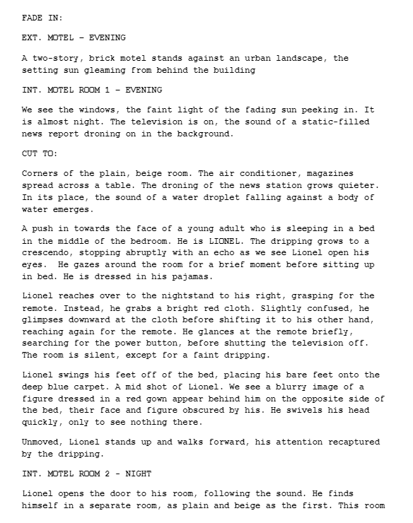
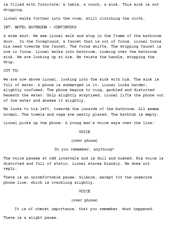
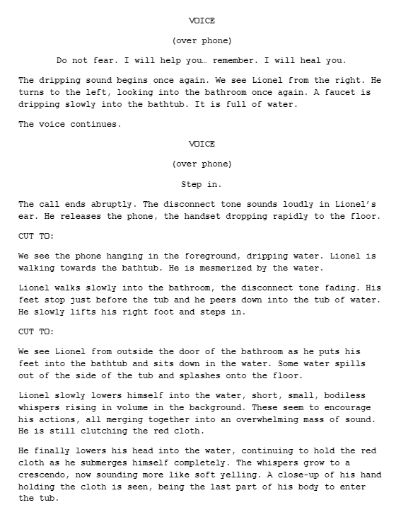
the official script!

As promised in my previous post, here is the update on our script which is finally finished! Of course, this is subject to change as things might be extracted or included during the post production phase. This wonderfully written script was done by our group member Pierce Thomas. Given his exemplary talent in imaginative writing and storytelling, we felt that this task suited him appropriately. 🙂 A link to his blog will be listed below!

Pierce’s Blog:  http://elucidation.home.blog

our film pitch to blumhouse studios!

attached below is the transcript for our film pitch video!

Our Plotline:

OUR FILM, LUCID ELUCIDATIONS, IS A MYSTERY/PSYCHOLOGICAL THRILLER FILM THAT FOCUSES ON ONE MAN WHOSE PAST IS UNCLEAR AND HIS SURROUNDINGS EVEN MORE SO. HE DOESN’T REMEMBER WHO HE IS, LET ALONE WHAT HE DID. HE CAN’T REMEMBER, BUT HE NEEDS TO – AT LEAST, THAT’S WHAT THE VOICES KEEP TELLING HIM. HE’S A PRISONER OF HIS OWN MIND AND THE FANTASIES AND ILLUSIONS IT WEAVES, CAUSED BY HEAD TRAUMA, INJURIES THAT LANDED HIM NOT ONLY IN THE HOSPITAL, BUT ALSO A MENTAL FACILITY. IN A WORLD WHERE THE LINE BETWEEN FANTASY AND REALITY IS INDISTINGUISHABLE, THIS FILM EXPLORES THIS MAN TRAVERSING THROUGH HIS MEMORIES TO FIGURE OUT THE TRUTH. NOT ONLY WHAT HE SUPPOSEDLY DID, BUT ALSO WHAT HIS MIND IS TRYING TO SHOW HIM.​

Our Chosen Production Company

WE’VE CHOSEN BLUMHOUSE STUDIOS AS OUR PRODUCTION COMPANY GIVEN ITS SPECIALTY AND EXPERIENCE PRODUCING QUALITY HORROR FILMS ON A GENERALLY LOW BUDGET. BLUMHOUSE HAS PRODUCED MANY SUCCESSFUL HORROR FILMS SUCH AS GET OUT (2016), THE VISIT (2015) AND HAPPY DEATH DAY (2017). ALL OF THESE FILMS ARE SIMILAR TO OURS THEMATICALLY IN THE SENSE THAT THEY APPEAL TO THE VIEWERS SENSE OF  UNEASINESS AND CONTAIN PSYCHOLOGICAL ELEMENTS THAT PERTURB THE AUDIENCE. ​

Our Requested Budget

FOR OUR FILM WE WILL HAVE A LOW BUDGET OF APPROXIMATELY $5,000,000. WE DECIDED ON THIS NUMBER AFTER RESEARCHING SIMILAR  THRILLER FILMS PRODUCED UNDER BLUMHOUSE PRODUCTIONS, SUCH AS GET OUT  AND THE VISIT , WHOSE BUDGETS WERE APPROXIMATELY $5,000,000 EACH,  AND TRUTH OR DARE, WHOSE BUDGET WAS $3,500,000. WITHIN THIS BUDGET, WE WILL NOT BE SPENDING IT TOWARDS BUYING THE RIGHTS FOR THE SCRIPT AS WE WILL BE WRITING OUR OWN. HOWEVER, WE WILL HAVE TO SPLIT OUR BUDGET AMONGST OTHER FACTORS, SUCH AS SALARIES FOR THE CAST AND CREW, CAMERA EQUIPMENT, COSTUMING, MAKEUP, PROPS, SET CONSTRUCTION, AND ANY POSSIBLE TRAVEL FEES SUCH AS HOTEL RENTALS, GAS, ETC., TO NAME A FEW. ​

Distribution

AFTER EXTENSIVE RESEARCH INTO WHICH DISTRIBUTION COMPANY WOULD BE BEST FOR OUR FILM, ‘LUCID ELUCIDATIONS’, WE HAVE A FEW POSSIBLE OPTIONS FOR WHAT WE WILL CHOOSE. WE FIRSTLY WILL PREMIERE OUR FILM AT SUNDANCE FILM FESTIVAL, WHERE THERE IS A CHANCE FOR THE MOVIE TO BUILD A REPUTATION AND CREDENTIALS, SUCH AS AWARDS OR PRAISE FROM CRITICS. OUR CHOSEN PRODUCTION COMPANY, BLUMHOUSE PRODUCTIONS, HAS A 10 YEAR “FIRST LOOK” DEAL WITH UNIVERSAL PICTURES, ALLOWING UNIVERSAL TO GET THE FIRST GLANCE AT ANY NEW WORK FROM BLUMHOUSE PRODUCTIONS AND DECIDE RATHER OR NOT THEY WILL APPROVE OF THE FILM OR NOT.​ IN THE CASE UNIVERSAL PICTURES DOES NOT APPROVE OF OUR FILM, WE CHOOSE A24 FILMS AS OUR SELECTED DISTRIBUTION COMPANY, AS THEY HAVE PRODUCED FILMS THAT FIT INTO A SIMILAR GENRE AS OUR FILM, SUCH AS ‘THE WITCH’ (2015) AND ‘HEREDITARY’ (2018), WHICH ALSO HAVE SIMILAR BUDGETS TO OUR FILM, AS ‘THE WITCH’ HAD A BUDGET OF $4 MILLION USD AND ‘HEREDITARY’ HAD A BUDGET OF $9 MILLION USD. DUE TO THE FACT THEY HAVE MADE LOWER BUDGET FILMS SIMILAR TO OUR GENRE, WHICH WERE VERY SUCCESSFUL (‘HEREDITARY’ GROSSED $44 MILLION USD WITH A $9M BUDGET), WE FEEL AS IF THEY WOULD BE OUR NEXT BEST CHOICE OF DISTRIBUTION COMPANY.​

film distribution!

There are several modes of exhibition a film can undergo, but generally, they are distinguished between two main roles: theatrical, and non theatrical release. We have decided our film will experience both types of exhibition, so that we can gain the viewing-ship for both audiences they tend to accumulate.

Theatrical release, is, in layman’s terms, a movie that is shown in theaters for wide release. It is generally quite expensive to have a movie shown in theaters, so we would have to ensure our film is marketed and advertised well so as to prevent financial losses. The movie theater pays an average of about 50-55% of its ticket sales to the movie studio as film rental fees, of which the percentage decreases as the duration of a film’s showing continues. This is done as an incentive to theaters to keep movies in the theater longer. Our film will be presented for about 4 weeks.

The next method of exhibition is considered non theatrical release. This includes anything from streaming, (such as Hulu, Netflix etc.) home video, and cable. This will an effective way to distribute our film, as the popularity of digital streaming has become increasingly apparent over the last few years. In a poll conducted by CNBC of 801 Americans around the country, the results showed that 57 percent of the public has some form of streaming service, 60% of which who use Netflix. Having our film made available from the comfort of one’s home will be very effective in creating more popularity for our film.

A graph showing the relationship between Americans choices of streaming platforms

One last method of non theatrical exhibition includes displaying a film at a film festival. This is done before a theatrical release and will not only give some the opportunity to see the movie early, but give critics the chance to review our film. If the reviews are positive, it will accumulate hype for the movie’s theatrical release, ensuring that it is a hit at the box office.

Sources Cited

our brand!

“Branding” is loosely defined as “the overall experience of a customer that distinguishes an organization or product from its rivals in the eyes of the customer.” Immediately when I think of branding, I think of multi-million dollar companies such as Apple, Samsung, and the like, followed by their associated reputations. For instance, Apple is known for their exemplary camera quality, and Samsung is known for their innovative phone technologies. In order to make our film stand out in theaters we must ensure we have a solid understanding of our individual brand, since the impression our film leaves on the consumers will, ultimately, determine it’s success.

Though my group and I have not yet decided what the branding of our film will be exactly, we do have some ideas. For one, we would like to incorporate imagery of water, eyes, and jarring colors, such as that of the pastel ones shown in our film poster shown here. This poster was created by our editor, Ben Isaacs, with the intention of inducing a creeped, almost uncomfortable feeling. I feel this was achieved well, and could definitely be a great marketing technique in advertising our film and establishing meaning within the film itself.

Seen above are the various movie posters that have been released for the upcoming movie “Us”. It can be seen that the movie characterizes itself through the use of a consistent color pallet (reds, whites, and blacks) , title font, and imagery. (eyes, scissors, shadows, ink splots) Additionally, the poster includes the name of it’s director, Jordan Peele, who is famously known for his success with the movie “Get Out“. Since Peele has developed a reputation for producing innovative horror films, people are going to be more encouraged to see the film than if it was a lesser known director. These are all examples of film branding that will influence us to see the movie and distinguish it from others on the market.

Sources Cited: 

case study: saw B^)

In order to perfectly construct my film I have decided to review one of my favorite thrillers of all time from the beginning of it’s production all the way to it’s final execution. Without further a do, let’s begin! :0

History/ Target Audience 

Saw 1, released in 2004, began as a seven minute short film directed by James Wan and written by Leigh Whannel. The short was pitched to Lionsgate and with roaring approval, the pair was granted a small budget of 1 million dollars to make what is now known as one of the highest grossing horror series of all time.

Production 

The most incredible part of Saw’s production was perhaps it’s ability to work wonders with it’s severely limited resources. The film consisted of only three actors (one of which was the scriptwriter himself, Leigh Whannel) and was shot in only one location. This location, a dingy run down basement was not only arduous on the actors, but Wan as well as the scheduling constrictions were extremely tight. This resulted in shoots that lasted as long as 12 hours on a typical day. The film was shot in 18 days and there were no rehearsals for the actors, rather, the rehearsal takes were actual footage for the film. Wan explained that the style instead ended up being “more gritty and rough around the edges due to the lack of time and money that we had to shoot the movie with” but that it ultimately worked to their advantage as it became the aesthetic of the film.

“It was a really tough struggle for me. Every day, it was me fighting to get the shots I did not get. I had high aspirations, but there’s only so much you can do. ”

James Wan

“We did a lot of things to fill in gaps throughout the film. Whatever we cut to newspaper clippings…surveillance cameras, or we cut to still photography within the film, which now people say, ‘Wow, that’s such a cool experimental style of filmmaking’, we really did that out of necessity to fill in gaps we did not get during the filming,”

James Wan
Distribution 

After having it’s praises sung from Lionsgate, the film was distributed to Sundance Film Festival, where, a few days later it was premiered for 3 days in a packed movie theatre. Lionsgate had originally intended to release the film direct to video, but due to the positive reaction at Sundance, they chose to release it theatrically by Halloween. Initially, the film received a rating of NC-17, but after further evaluation, was rated R for it’s graphic and disturbing content, and exploitation of violence. Saw opened at #3 on Halloween weekend 2004 in 2,315 theaters and grossed $18.2 million, behind Ray, which earned $20 million and The Grudge ($21.8 million). According to Lionsgate’s exit poll, 60% of the mostly male audience was under 25 years of age.

Marketing

Ironically enough, the release of Saw came with the emergence of the “Give Til It Hurts” blood drive by Lionsgate which benefits the Red Cross. Donating blood for this event came with the reward of receiving tickets to see the film, which is an incredibly clever marketing technique on their part. With each release of a new Saw movie, the blood drive ran back up creating a tradition which would later characterize the series as a whole. Moreover, the release of the Saw’s trailer “teased and pontificated but gave away as little as humanly possible in terms of actual plot or visual spoilers. ” This created an highly regarded sense of anticipation for those who hadn’t gotten the chance of viewing the film at Sundance.

Cross Media Convergence and Synergy

Since Saw was released in 2004 and began as an indie film by two largely unknown people, the film was not designed to have received as much praise as it did. It received a mix of responses from critics, some comparing it’s excellence with that of “Se7en” (Fincher, 1995) and some going as far to claim it was “convoluted” and “carelessly underscores its own shaky narrative at every turn with its mid-budget hokiness.” After it’s theatrical release, it was made for DVD.

Sources Cited 

a dive into scriptwriting!

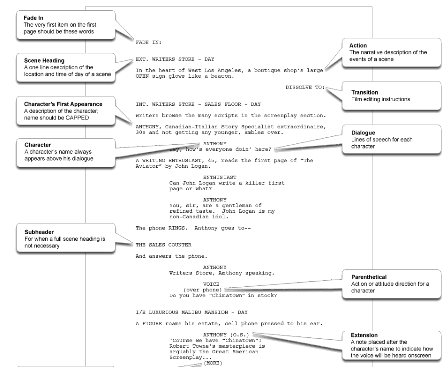
Since the making of our title sequence requires a strong grasp of how setting and plot are brought to life via our imaginations and then directly to the big screen, a script seems to be an obvious yet essential tool to aid in doing so. This will not only provide guidance as to the direction and pacing of our film, but help to sort out our ideas in an organized fashion so that we are prepared for shooting. As such, I have decided to dive into the nuances of script writing and will outline what exactly makes for a good script. Attached below is a general outline for the format of a professional film script.

Based off this example, an important characteristic of scripts seems to be its use of sensory details and emotive language to create a distinct vision of the atmosphere and scene. In addition to this, there are a direct statement of events detailing the character’s dialogue and mannerisms. (ie the capitalization of character names followed by their dialogue directly below) This contradicted my initial impression of a script, which I thought consisted of dialogue exclusively. After doing research I also discovered that a formatted script page in Courier font equals roughly one minute of screen time. Based off this estimate, we will try to limit our script to 2, possibly 3, pages maximum.

An official excerpt of the film script for “Get Out”

My group and I have not yet begun the process of writing our script (T^T) , however, I would imagine that based off our discussions regarding the plot it would probably look something like this:

Again, this is just an example of what our script could entail and was made mostly for the purpose of generating practice and understand of the specificalities associated with scriptwriting. It is unlikely that the script will remain this way and of course is subject to change as our ideas shift. It goes without saying, when the official script is written I will be sure to blog about it. 🙂

Sources Cited